Building a Neutral Palette for Overcast Irish Days
The right neutral colors maximize natural light and create a calm foundation. Simple daily tidying routines keep everything looking effortless.

Why Color Matters More Than You'd Think
Most Irish homes don't get blazing sunshine. That's just the reality. Grey skies, soft light filtering through small windows, and those endless rainy days shape how we live. Your color palette either works with this light or fights against it.
Here's the thing — you don't need bright whites or bold colors to make a space feel alive. A thoughtfully chosen neutral palette actually reflects more light and creates a calm, spacious feeling. It's not boring. It's intentional.
We've worked with dozens of families in small Irish homes who've transformed their spaces just by shifting their color approach. The results? Rooms feel bigger, brighter, and genuinely peaceful.

The Three-Tone Foundation
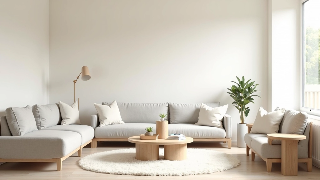
Your neutral palette needs three core tones — and we're not talking about pure white, grey, and black.
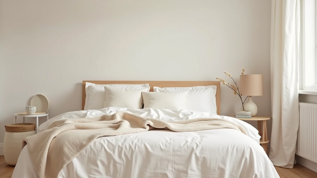
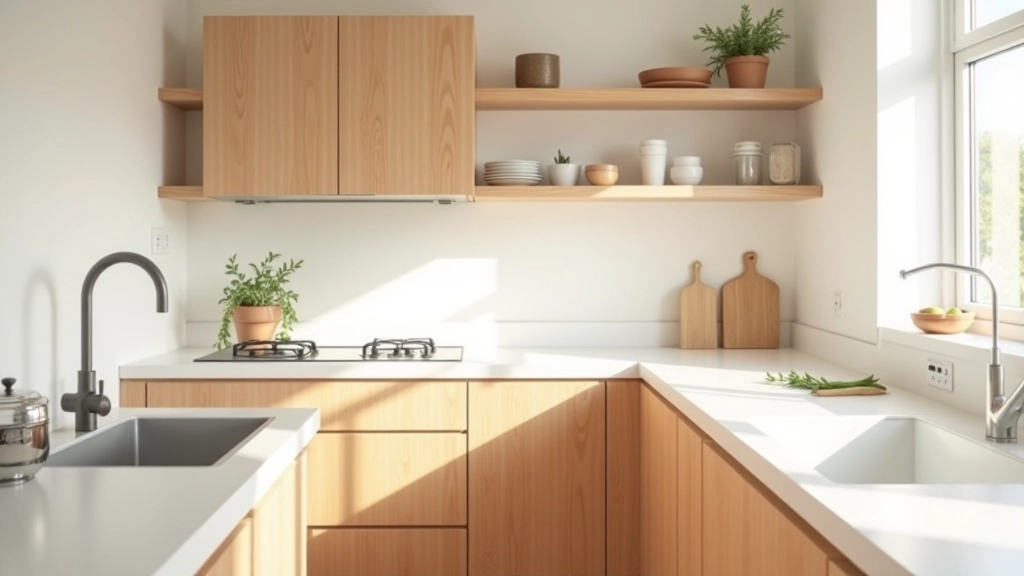
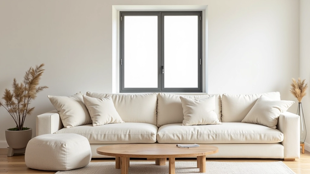
Warm white or off-white is your ceiling and trim color. Something with just a hint of warmth — like magnolia or cream — bounces light around without feeling clinical. Pure white actually creates harsh reflections on overcast days.
Soft grey (your wall color) should be barely-there. Think dove grey, soft taupe, or warm greige rather than anything that looks like a rainy sky. It's subtle enough that natural light still dominates, but enough to add depth and definition to a room.
Warm accent tone — maybe a soft stone, warm beige, or pale mushroom — appears in smaller areas. Not as the main wall color, but as a feature or accent wall, or in furniture pieces. This prevents the space from feeling flat.
Don't overthink the exact names. Visit a paint shop and hold samples against your actual walls in morning light, afternoon light, and on a rainy day. You'll see which ones feel right.
Maximizing Light in Grey Weather
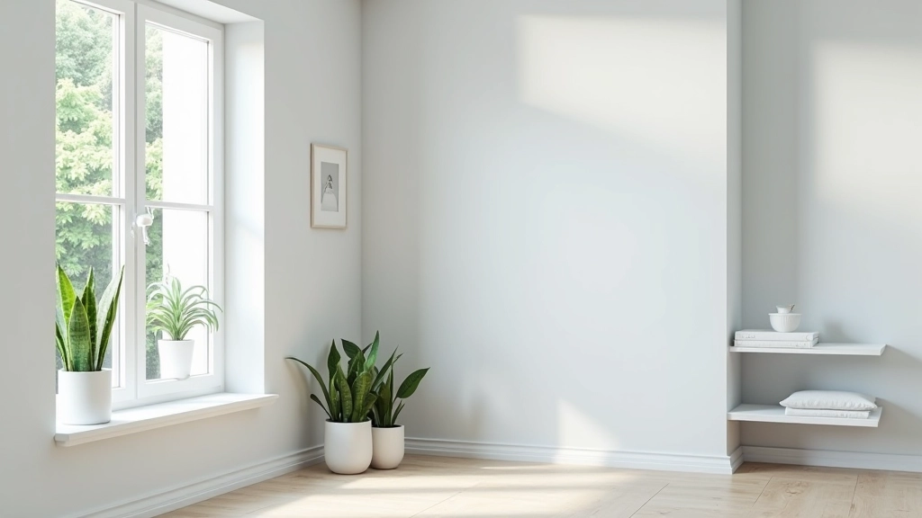
Here's what actually happens on an overcast Irish day: soft, diffused light comes through your windows. It's not harsh. It's gentle. And neutral colors don't fight it — they work with it.
Keep your walls in the lighter range of your chosen grey. We're talking 60-70% light reflectance value (LRV), not darker. If a wall feels darker in the paint tin, it'll feel heavy in a room with limited natural light.
Windows themselves become your color accents. Keep them clean — obvious, but honestly, a dusty window can make a room feel 30% dimmer. Use simple, light-colored curtains or blinds if you need them. Heavy drapes absorb light you can't afford to lose.
Mirror placement matters too. One large mirror opposite a window bounces light back into the room. You're not being precious about it — you're being practical.
Keeping Your Palette Looking Fresh
A neutral palette works brilliantly for one reason: clutter shows immediately. That's actually the strength, not a weakness.
This is where daily tidying comes in. Not deep cleaning. Just 10 minutes before bed: return things to their places, clear kitchen counters, straighten cushions. When your backdrop is calm, a few items out of place jumps out at you. So you don't leave it that way.
The habit becomes automatic. You're not fighting your space anymore — you're just maintaining what you've built. Clutter finds its way into every home. The difference is how quickly you notice it and move it back.
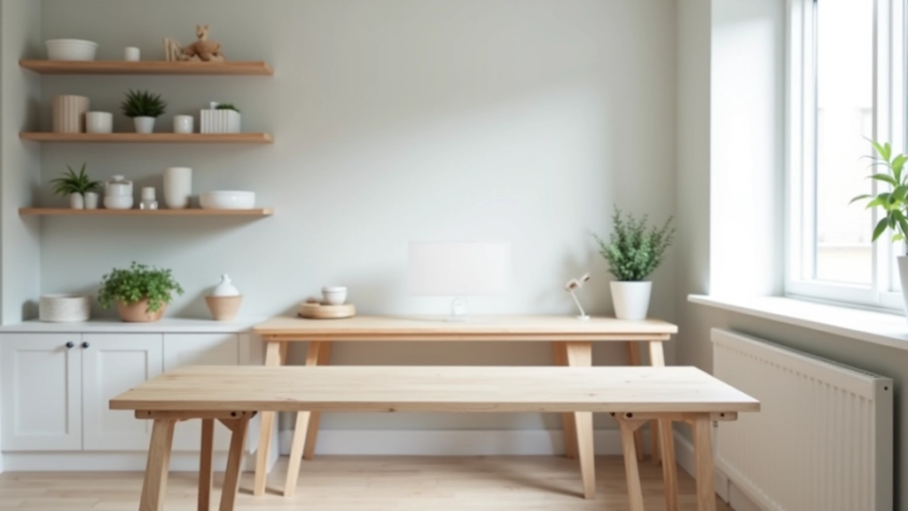
Neutral walls also mean your actual possessions become the visual interest. A wooden side table stands out. A plant in the corner gets noticed. A good book on the shelf draws the eye. Your stuff becomes the decoration, not competing with busy walls.
Quick tip: Choose one evening routine that works for you — maybe 8 PM, maybe before guests arrive. Consistency matters more than duration. Ten minutes of tidying daily beats an hour of panic cleaning on Friday night.
Adding Depth Without Color
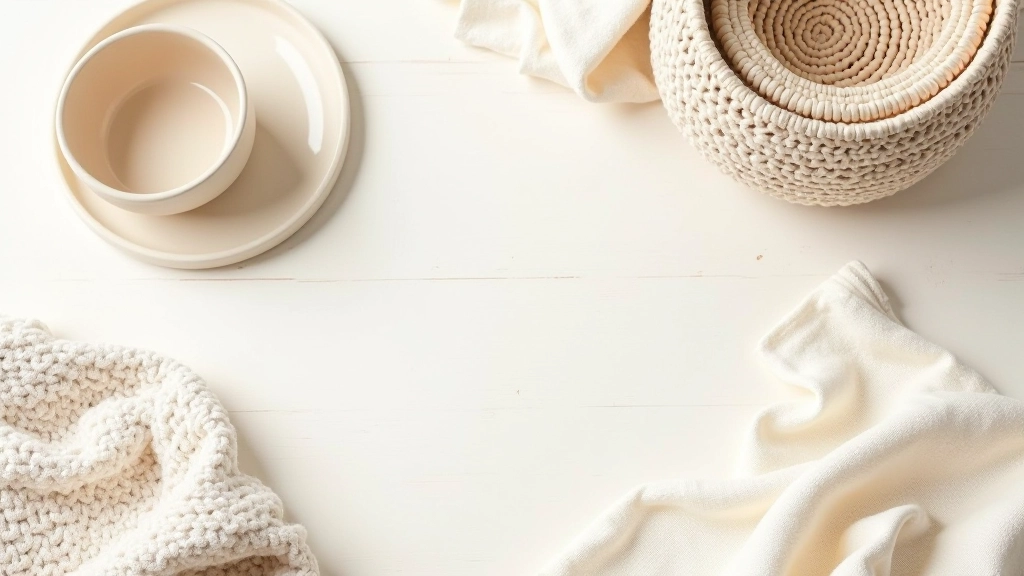
A purely neutral space could feel flat if you relied only on paint. But you're not. You're using texture.
Linen, wool, wood, and ceramic are your allies here. A wool throw in cream over a neutral sofa. Wooden shelving in warm oak. Linen curtains in natural ivory. A ceramic vase in soft stone. These materials have variation within their neutral tones — the grain in wood, the weave in fabric, the glaze on pottery.
Texture catches light differently than flat paint. It creates visual interest and warmth. Your eye travels across the room, finding details. It's not boring. It's sophisticated.
This is also why your palette works in a small Irish home. You're not relying on wall color to define spaces — you're using material, texture, and arrangement. A terraced house with an open-plan living area doesn't feel cramped when everything breathes together in neutral tones.
Creating Your Calm Foundation
Building a neutral palette for an Irish home isn't about creating a blank canvas. It's about creating intention. You're saying: this space is calm, this light is enough, and clutter matters because the background is quiet.
Start with your walls. Choose one soft grey that feels right in your home's actual light. Pair it with a warm white for trim. Add texture through furniture and textiles. Then protect it with a simple daily tidying habit.
You don't need sunshine to create a bright, spacious feeling. You just need to work with the light you have, respect it, and build around it. That's how you get a home that actually feels like home.
About This Guide
This article provides educational information about color selection and home design principles for Irish living spaces. Individual results will vary based on your home's specific lighting conditions, architecture, and personal preferences. We recommend testing paint colors in your own space before committing to full walls. Color perception is subjective and influenced by individual vision, existing furnishings, and natural light patterns. Consult with a professional interior designer if you're working on a major renovation or renovation project.